Research
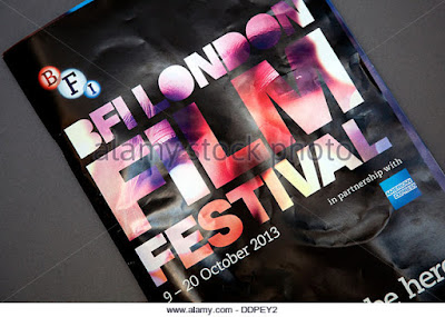
2) There is a title of publication present at the centre of the cover. This would differ in comparison to a magazine cover since the text is presented at the centre rather than at the top which would be the general place for a title to be in magazines. The central image is also seen merged with the text that would make it a lot more visually interesting for the readers to be intrigued about the content that is inside the promotional material. The colour scheme is of a pink-black colour scheme with variants of pink used in the picture that would then be used to make the image look interesting and not look a little off in the sense that it would make the imagery look bad or unappealing to the viewer which would make it harder for the promotional booklet to reach it's audience as it would receive a bad impression on the audience. The language used in the cover is mineralised to ensure that the brochure could attract an audience. It is limited in text which would make sure that it isn't dull looking as it would be seen as having to make sure that the cover looks interesting and can attract a reader with minimal words. The date is placed below the logo with a white on black contrast to make the date stand-out but not as visually appealing as the main text that is presented.
3)


This cover has some artistic elements that would make it seem quite unique. This would also highlight that this is an institution which is based on an arthouse cover. This would also look to have the logo since this would be seen as quite good.
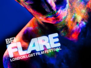
In a majority of "The Flare" covers, these would show an artistic feature that would allow it to look unique. This cover has a black background with a contrast from the picture to make it look quite professional and have the focus point of the cover on the picture where the title is present.
This is another cover that was introduced in the same year as the "BFI Flare" cover which could suggest that the use of a black background and bright text in front makes the visual point the brochure. I could also implement a similar technique with the black background and the contrast to make the text the visually appealing factor of the cover.
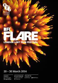
This cover takes the theme of the text standing out in comparison to the dull red background that is used. This could make the text look more presentable. And especially since this is an art-house film festival cover, this would use artistic values to promote their festivals so that they look appealing to an audience. From the four covers that i have currently looked at, the four all use a single colour background that would then be used to be contrasted by the text that would be present.
This over goes against the norm that I would be expecting with the backgrounds since this has reversed role. This has reversed in the sense that now the visually interesting feature of the cover is now the background. In comparison to the previous that I have looked at, this cover makes the background as the visually interesting since this would be seen as the element that could attract an audience. As well as that, this could also make the different covers seem different in comparison which could present an element of being unique. I might take the background element of the cover for future for when I'm creating the actual product.
4)
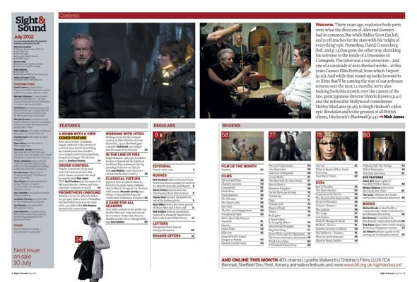
The use of pictures that surround the contents page can attract a reader. Pictures of the topic can give audiences a visual impression as to what they should expect prior to reading it. The size of pictures could also present the different films and their significance in the magazine that they are about to read.
This contents page and the ones upcoming aren't related to art-house film however there is some aspect of having to try and make it look appealing. This can be evidenced with the picture of that main character that will be talked about or featured the most in the magazine. However I can't really use the "collect them all" segment that is featured bottom left as since the one that I'm bound to create is an art-house based film, this would mean that I can't feature something that suggests that this is promotional material for the other magazines.
What makes this contents page look quite unique is the use of pictures. The use of pictures dominate the amount of pictures that are available to the reader to look at and suggest that they are relevant to the issue is presented with the links that the numbers have on each topic that would be talked about in the pages. I could do something similar with the numbers as I could implement the same technique to make it easier for an audience to try and locate specific stories.
This contents page uses a monochrome colour scheme which is also present with the genre that I'm working on which is a noir film. This is also present with the use of photos at the side that could be used as a guideline for what the contents page could look like. The use of font also presents the contents page in a suitable manor as there shouldn't be font that looks a little off from the theme of the film/cover.
This contents page is also presented with picture dominance. This factor could be useful for when I'm creating my contents page, I should be cautious and make sure that the text doesn't overwhelm the pictures. This would therefore be the main focus of having to try and making a visually appealing contents page.
Planning and sketching
1) Target Audience Interests:
- Suspense.
- A good narrative.
- Interesting characters.
- Protagonist motives correlate to the character
- Serious tone through out.
- Antagonist who seems evil and that the audience would want to hate rather than not care about.
- Presenting the control of the gangsters and what makes them fearful.
4) Features of the Contents Page:
- Feature Film.
- Highlight other films that would be included.
- Other pages.
- Pictures that relate to the contents page.
- Fonts that relate to the theme of the cover.
Photoshoot
1) The main character will be Tony Bantino with his covert suit on as the blue suit.
2) The images required would be the images of the diffrent productions that are also being created to create some other photos to look at besides the Exposure pictures.
3) The big image would be the shot of Tony Bantino but expanded further to cover half a page so that there can be space for quotes from the film to add in.
5) The costume would be the blue suit that will be worn in the 3 minute scene as there would be some synergy between both cover and three minute extract.
6) There will be contact with the different members of "Exposure" to talk about the essentials an if they are ready or not.
No comments:
Post a Comment